Broke Hold logos and brand assets
Every logo, icon, banner and favicon in the sizes you need, plus colours, type and approved descriptions. Free to use for partner listings, press and directories.
Everything in one download
All logos, icons, banners and favicons, plus a README with colours, type and copy. 4.2 MB.
Logos
Use the vector SVG whenever the tool accepts it. PNGs have transparent backgrounds.





Mark, icons and profile pictures
The navy icon is the profile picture for every network. It is centred so circular crops keep the whole mark.






























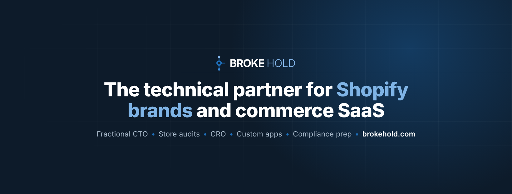
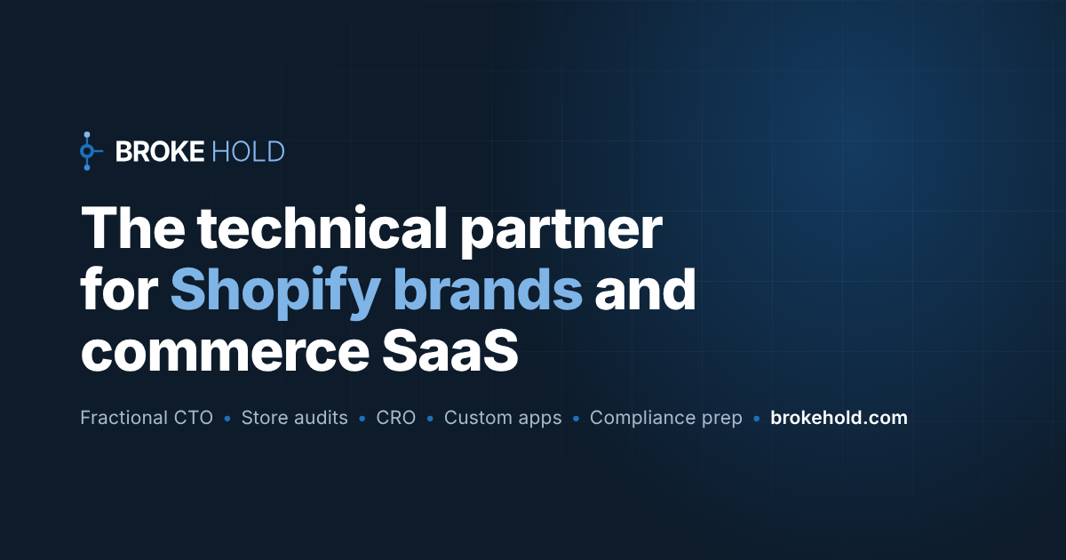
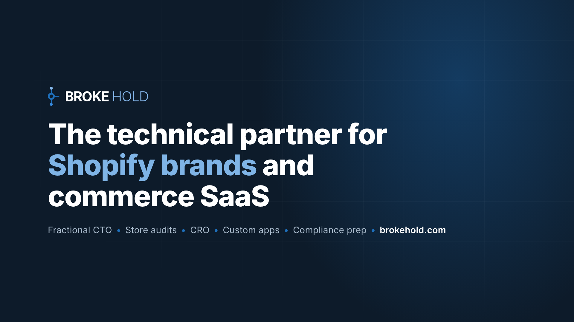
Covers and banners
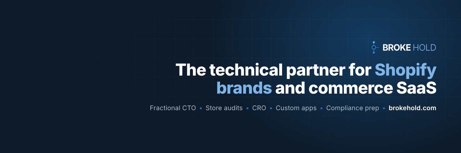
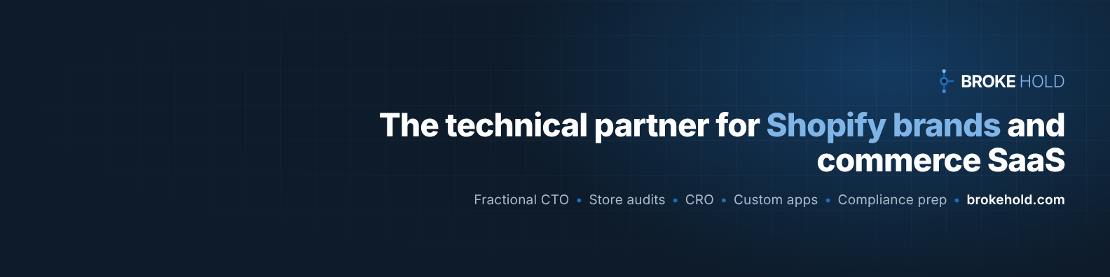
Sized to each network. Text sits clear of where profile pictures overlap.


Favicons
Browser tab and home-screen icons for websites and web apps.




Colours
Click a colour to copy its hex code. Navy and blue do most of the work; the rest support them.
Type
Inter for everything, free from Google Fonts. JetBrains Mono for code.
Inter ExtraBold 800
Tight line height, slight negative tracking.
Inter SemiBold 600
Section titles, buttons, labels.
Inter Regular 400
Body copy at 15 to 19px, line height about 1.6.
About Broke Hold
Ready-to-paste descriptions for directories, profiles and partner pages. In text, write "Broke Hold" (two words); the legal name is Broke Hold LLC.
One line
Fractional CTO and commerce engineering for Shopify brands and commerce SaaS.
Short
Broke Hold is the technical partner for Shopify brands and commerce SaaS companies. We own the technology behind growing ecommerce brands: the store, the stack, the integrations and the data. For commerce SaaS, we build the marketplace integrations and compliance groundwork their products depend on. Based in New Jersey.
Long
Broke Hold is a New Jersey based technical partner for Shopify brands and commerce SaaS companies. For brands, we work as a fractional CTO and engineering team: store audits, conversion work, custom apps and automation, and AI-connected operations. For commerce SaaS, we build marketplace integrations, guide platform app approvals, and prepare teams for security reviews and compliance audits. Every engagement starts with a written, fixed-scope proposal, and we price for outcomes, not hours.
Using the logo
- Keep clear space around the logo at least the width of the mark's centre circle.
- Minimum size: horizontal logo 120px wide on screen or 1 inch in print; the mark 16px tall.
- Use the colour logo on white or light backgrounds and the white logo on navy, dark or photos.
- Do not stretch, rotate, recolour, outline, or add shadows or effects.
- Do not rearrange the mark and the words or change the lettering.
- For partner and press use, link to brokehold.com where you can.